Best Interior Paint Colors for 2026: What's Trending in Chicago Homes
What's Defining Interior Color in 2026
The interior color story for 2026 is a reaction to the cold-gray-and-white minimalism that dominated the last decade. Homeowners across Chicago — from gut-renovated Logan Square condos to Lincoln Park greystones — are moving toward warmth, texture, and considered color. The shift isn't toward bold or maximalist interiors; it's toward colors that feel grounded and genuinely livable rather than architecturally sterile.
Here's a room-by-room guide to what's working in Chicago homes right now, with specific product recommendations from Sherwin-Williams — the two brands we work with exclusively.
The Five Major Color Directions for 2026
1. Warm Whites — Not Stark, Not Yellow
The era of the stark, cold white interior (think hospital whites and cool grays) is receding. 2026's dominant white is warm — with creamy, slightly peachy, or linen undertones that make a room feel inhabited rather than staged. These whites work in virtually every room and every light condition in Chicago's varied residential architecture.
Best picks: Sherwin-Williams Alabaster SW-7008 is the most versatile warm white we specify — it has a barely perceptible cream undertone that warms naturally lit rooms without going yellow in artificial light. Sherwin-Williams White Dove OC-17 is softer and slightly warmer. For something with more body, Sherwin-Williams Navajo White OC-95 reads as a true warm white-cream and looks exceptional in rooms with good natural light.
2. Earthy Terracottas and Warm Rusts
Terracotta is having a significant moment, particularly in dining rooms, primary bedrooms, and home offices. These colors are warm and enveloping in a way that neutral greiges simply aren't, and they work remarkably well with Chicago's urban context — natural wood floors, brick fireplaces, and the raw industrial elements common in loft and condo conversions.
Best picks: Sherwin-Williams Terra Cotta Tile 2090-30 is a sophisticated, muted rust that doesn't read as Halloween orange. Sherwin-Williams Cavern Clay SW-7701 (their 2019 Color of the Year, still trending strongly in 2026) is an earthy, warm pink-orange that feels both current and timeless. Use in dining rooms and bedrooms; approach kitchens carefully as terracotta can feel overpowering in a cooking space with food colors competing.
3. Moody Blues and Blue-Greens
Deep, moody blues — particularly those with green or gray undertones — are the go-to color for creating intimate, sophisticated rooms. Chicago's open-plan condos often have one room that benefits from being "pulled in" visually, and a deep blue does this more effectively than any other color. Library walls, primary bedrooms, and home offices are the most natural applications.
Best picks: Sherwin-Williams Van Deusen Blue HC-156 is a deep, classic blue that looks stunning in rooms with good light (it reads as almost black in dark rooms — account for this). Sherwin-Williams Commodore SW-6524 is a slightly more blue-teal option with beautiful depth. For something less dark, Sherwin-Williams Wolf Gray 2127-40 bridges blue and gray in a way that reads as sophisticated in natural Chicago north-facing light.
4. Soft Sage and Dusty Greens
Interior greens in 2026 are soft and desaturated — nothing vivid or forest-dark. The target is a color that adds the warmth and life of green without dominating the room. These are particularly popular in kitchens, bathrooms, and as whole-home neutral systems in Chicago's newer construction.
Best picks: Sherwin-Williams Clary Sage SW-6178 is the most-specified interior green in our 2026 projects — it bridges gray and green beautifully and looks equally good in natural and artificial light. Sherwin-Williams Dried Thyme CSP-820 is slightly greener and warmer, excellent for kitchens. Sherwin-Williams Aganthus Green 461 brings more depth for rooms where you want the color to be noticed.
5. Warm Taupes and Brown-Grays
The cold grays that defined 2015–2022 are being replaced by warm taupes and brown-grays that read as more sophisticated and easier to furnish. These colors work exceptionally well as whole-home neutrals in Chicago's open-floor-plan layouts where you need a color that functions in multiple light conditions across connected spaces.
Best picks: Sherwin-Williams Pale Oak OC-20 is the most versatile warm neutral we use — it shifts from taupe to warm beige depending on light and time of day. Sherwin-Williams Agreeable Gray SW-7029 remains one of the most requested neutrals in Chicago repaints. For more depth, Sherwin-Williams Revere Pewter HC-172 is a warm, complex gray that reads beautifully in spaces with mixed natural and artificial light.
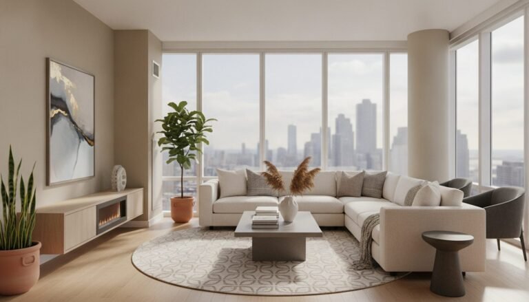
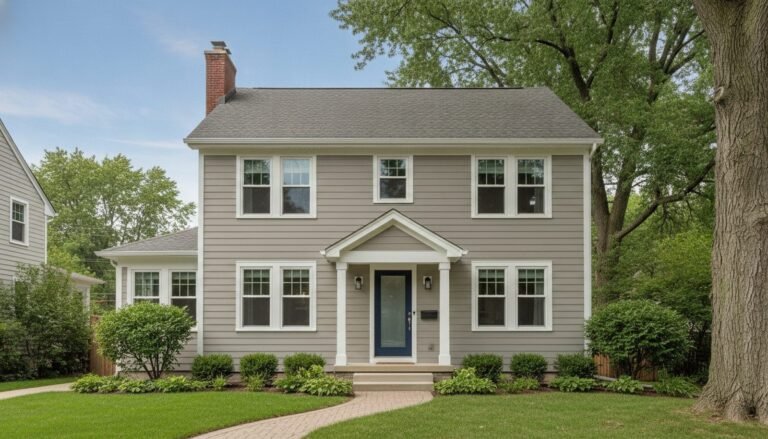
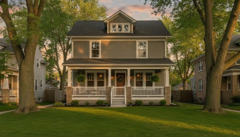
Color Showcase
How Chicago's Natural Light Affects Color
Chicago's light is different from coastal cities. The city's flat topography, high latitude (41°N), and long winters with lower sun angles create a cooler, flatter light for most of the year. This means:
- Colors with warm undertones (creams, taupes, terracottas) perform exceptionally well in Chicago because they counterbalance the cool light
- Cool grays and blues can feel oppressive in north-facing Chicago rooms, especially in winter — use these in south or east-facing rooms with good light, or use warmer versions with slight green or purple undertones
- Test colors at 10am and 3pm — Chicago's winter afternoon light is notably warmer and more golden than morning light, and some colors shift significantly
The Finish Guide: Which Sheen for Which Room
| Room | Recommended Finish | Why |
|---|---|---|
| Living room / dining room | Matte or flat | Hides imperfections; best color depth; minimal traffic |
| Bedroom | Matte or eggshell | Soft, restful finish; easy touch-ups |
| Kitchen walls | Eggshell or satin | Washable; handles cooking moisture and splatter |
| Bathroom | Satin or semi-gloss | Moisture resistant; easy to clean; handles humidity |
| Trim and doors | Semi-gloss or gloss | Durable; wipeable; defines architectural detail |
| Home office | Eggshell | Reduces glare; professional look; cleanable |
| Children's rooms | Satin | Most washable; handles crayons, scuffs, and sticky hands |
Creating Flow Through an Open Floor Plan
Chicago's newer condo construction and gut-renovated units often feature open-plan living/dining/kitchen areas where multiple "rooms" share the same visual space. The key to color in open plans is tonal consistency rather than identical color throughout. Choose a base neutral (Pale Oak OC-20, Agreeable Gray SW-7029, or Alabaster SW-7008) for the connective tissue of the space, then introduce a stronger color in one defined area — an accent wall, a ceiling color, or a deeper tone in the kitchen — to create visual zones without disrupting the sense of openness.
Choosing color is genuinely hard — screens and chips never match the final wall result. RenewBuild offers a complimentary color consultation with every estimate. We'll bring large paint samples, discuss your specific light conditions, and help you narrow to a final choice with confidence.
Get Your Free Estimate
We'll help you choose the right colors for every room, prep properly, and deliver a finish that lasts. Serving all Chicago neighborhoods.
Related Articles
RenewBuild Serves Chicago & North Shore
Looking for a painter near you? We serve homes and businesses across Chicagoland.